The New/Old Bath: why color matters

9 comments:
I have to admit to being somewhat of a sucker for the color of Jadeite. It must have something to do with Martha Stewart.  I collected it for a while in the 90's but found I enjoyed the color more when I use it as an accent color in fabric and knobs etc. as opposed to having too much.

This is a nice little bathroom with a large shower and wonderful vintage inspired toilet and pedestal sick from Waterworks.  The fixtures are brushed nickel from Rohl.  I like the simplicity of the mirror but it was really lacking in some pumped up vintage color to compliment all of the nice black and white tile work.
Enter Rejuvenation catalog.
One of my all time favorites for vintage inspired lighting & in the last few years they have begun reproducing bath and kitchen fixtures to compliment the period lighting.  The Jadeite green is so fun in this little bathroom.
Along with a pair of sconces, I purchased a toilet paper holder, small towel hook (which doubles as a flower vase holder) and the tooth brush goodie.  I like ice cream buckets for trash cans!
The floor tile is a small 1/2 inch mosaic of tumbled marble and the walls and shower are just simple 4x4 porcelain nicely arranged
I added the fun vintage post cards, all found on ebay, of various locations around Newport Beach.  We had them framed with little photo edges and a really narrow black frame

Here is a close up of one of the post cards:  It says  "Yachting, Balboa, California"
Bath hook as vase holder, Nantucket inspired!
I used the simple Jadeite glass pulls on the cabinet doors and more Nantucket inspired baskets for extra towels


The detail in the shower is really simple but using the 1/2 inch tiles as a detail is a great idea and very inexpensive.
Here is a close up of the sconces (not the best photo) but they are porcelain and very 50's.  I found the great green "No Vacancy" sign and thought it would be fun over the mirror.  I am such a sign junky it's not even funny anymore.  Some one please help me!!!
Take a look again at the before picture and I think you will agree that in the New/Old bathroom color really matters

Have a wonderful weekend and try not to get too crazy out there!

smiles : )
kelley

Hallways and Landings: Secret decorating spots often overlooked

19 comments:


The average hallway is sort of like your last trip to the grocery store:  not very exciting but you need to go through it to get to the good stuff... a great meal or in this case the back of the house!


This long and bright hallway is the link between the front of the house and the children's wing in the back.
It's an interesting little connection, in that it has some fun details that make it work as a design element as well

The banquette is sunny and warm most days and loaded with pillows made from my favorite vintage fabrics.  The solid fabric is raw silk (peach, sage and straw) and my upholsterer did a beautiful job with the hand sewn "scrunched" edging on the seat cushion and the bolsters.  I am so in love with old rag rugs right now and find the colors really fun and different and they make GREAT pillows.


There is storage under the window seat for big bulky comforters and photo albums and nice little spots along each side for artwork.


The arched windows lining the hall on either side add to the bright and sunny space and the high arched ceiling is crisp and fun in the fat bead board. The height also helps to define this space as more than just a hallway.

At the end of the hallway is a nice bookshelf stocked with some beautiful vintage treasures...well maybe not....on closer inspection


lots of interesting books

Suprise!  This is actually a secret door that leads to the back wing but can closed off to keep the noise and privacy in check.  I can't tell you how people LOVE this idea, especially children.

It is thick and heavy ( about 4 inches in width) but closes gently with a spring action closure.  I must admit this was not my design but that of the prior owner. I wanted to share it because it is such a GREAT IDEA.

The hallway continues on to the back of the house and is pretty typical from this point on.  


Stair landings are another great "secret spot" for a design detail or two.  I enjoy the simplicity of this little bamboo shelf, almost Shaker inspired, placed at the middle landing of the staircase

Landings are usually small and really can't be used for much but what a great spot to showcase collections.  I recently repainted the hand rails white (they were dark brown) to allow the stairs to feel more open and I removed all of the artwork.

At the second floor landing I have a crusty painted cabinet with my collection of Roseville pottery.
The lighting is from Dana Creath


There is accent lighting on the ceiling and it helps to showcase the pottery.
The floors throughout this home are solid walnut and very rustic


This spot happens to be favorite of my pal Millie.  How can dogs sleep so much?  Oops, I think I woke her up for her close-up.


At the very top of the stairs just before you exit to the roof deck is a small niche for some art, in this case, seaweed pressings and a little bamboo table

I really do like the little nooks and crannies of a house that are often overlooked and can be a source for inspiration and even a nice surprise now and then.

Any thoughts?  Would love to see your ideas too.  Please share your favorite secret decorating  spot!

Gotta run;  xo
kelley

Guest Room: soft and subtle

18 comments:

Just off the kitchen and nestled in a nice corner of our home near the beach, is this pretty and shaded guest room

My inspiration for this room again came from the fabric choices.  I started with this older pattern from Ralph Lauren that has a coordinating stripe.  The colors are soft yellows, a touch of mint green and orange


I used the stripe on the horizontal for this simple headboard.  The monogrammed sheet is a vintage find from my friend and "textile queen" Wendy Lewis at Textile trunk.  I had my upholsterer drape the sheet over the headboard and secure the sides with ties.  The sheet and ties are actually secured to the back and only look draped.  We used up all different parts of the sheet for this project...no fabric was wasted!

Lots of pillows:  more vintage linen feed sack fabric and sweater weave


On either side of the bed are very small spool tables from Mitchell Gold.  The lamps are a dark brown wicker and I used the Ralph Lauren floral on the lamps shades as well.  An interesting note about fabric lampshades is that they diffuse light differently than traditional lampshade fabric.  Its alot more soft and warm feeling.

The Audrey Pendant is a wonderful ceiling fixture and the shade is a plain white linen.  Lots of vintage baskets and a teal chinoise screen pull the colors together.
The Ralph Lauren stripe was also used in the bedskirt and the corners pleated with left over linen from the vintage sheet used for the headboard

The bed linens are from L'erbe in silk and are really soft and scruptious.
The curtains came from Smith and Noble, which most everyone is familiar with.  I had the pin-tuck stripe sewn on the horizontal for some added interest and the rod is a big 3" inch chunky wood, stained dark to match the lamps.  The curtain rings are bamboo.

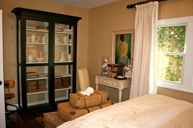
Opposite the bed is a really large cabinet.  I should probably put a TV in here but I'm not too crazy about too much technology in the bedroom  The cabinet is full of books and a fun collection of white matte glazed vintage pottery.  Nothing very expensive but when grouped together it makes a nice collection.


The wall covering is from Phillip Jeffries and is a natural grass cloth.  A great idea is to use wall paper on the back of a cabinet so it disappears into the wall.  That is what I have done here and you can always  peel it  off when you move the piece to a new location

Vintage seaside photos over the bed add a nice finish

All of my guests seem to really like this room because it is very calm and the light is really soft and cozy.

Just waiting for my next visitor!
Thanks for stopping by and don't forget to click on the photos if you want to see them full screen.

Have a great day
kelley

Master Bedroom Fabric Choices: Botanical Inspiration

18 comments:

I really enjoy using fabric both new and vintage in different ways and I strive not to be to "matchy-matchy" but not too busy either.
I have collected a pretty large number of hand tinted botanical prints and I used the colors in the florals as a starting point in choosing the fabric for this master retreat.

The chairs were purchased first.  They are from Quatrine and are a modern wing chair with a flanged welt.  The fabric in both the subtle neutral stripe and the tiny green paisley is  100% linen.  All of Quatrine's furniture is slipcovered and pre-washed and is very well made.  It's not real frilly or stuffy furniture so it goes with many different styles of interiors.


It compliments nicely with the vintage ticking pillows with a black woven stripe

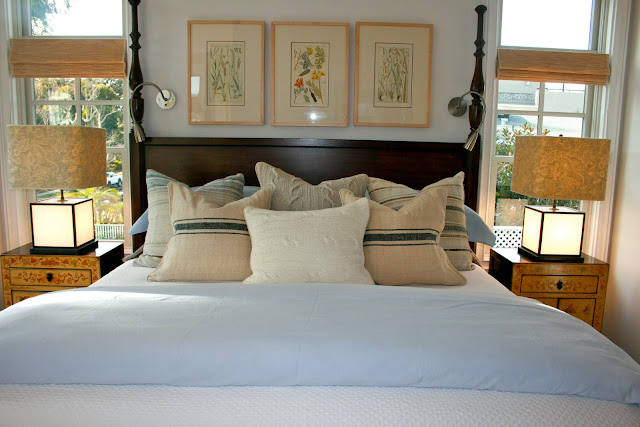
Here is a shot of the four poster bed from Ralph Lauren.   The lamps are from Circa Lighting, I think they were called SoHo.  The shades that came with the lamps were paper but the lamps themselves are really great.  The bases also light up!  The side tables are reproduction chinoiserie in a soft yellow with green and orange detailing.


Here is what the lamps are like now with there new shades in the same small paisley from Quatrine.  I had the edges trimmed in a soft green grosgrain ribbon.

Adjacent to the bedroom is a lovely sitting area where I placed the wing chairs.  This is an octagonal space so I thought it would be fun to do grass cloth wall covering (Phillip Jeffries) in just this area of the space to set it apart from the rest of the bedroom.  It also has a nice little fire place with a natural grey limestone surround.

A little wet bar with a fridge (behind door) is a nice addition to any master.


Just off the bedroom is a small balcony with just enough room to sit and enjoy a cup of coffee.  It's usually really warm and sunny in that spot and my dog Millie likes it more than any one!

The pillows are done in more vintage fabric and rag rugs.  The bed linens are heavy Belgian linen from Liebeco and the woven window shades are from Conrad.

A nice space and not overly "matchy"& I think the botanicals were a great place to start!

 It hard to compete with the sunshine and a beautiful blue sky here today so I think I will head outside for the rest of the afternoon.  Have a wonderful and happy weekend.

best~*~kelley