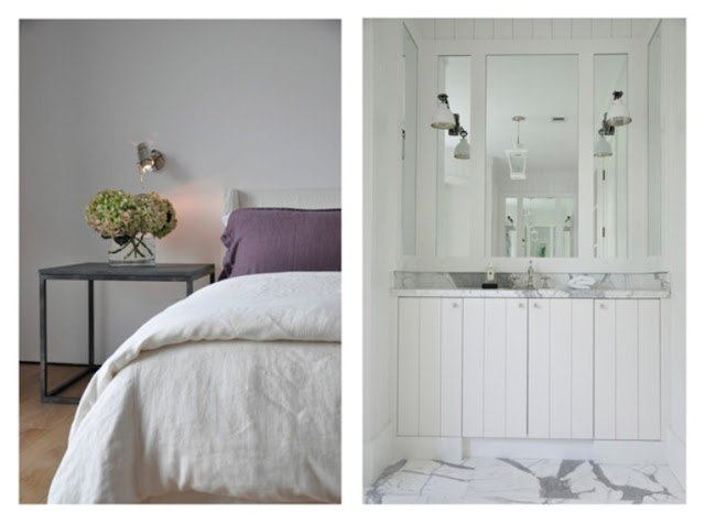
I am seriously in big time love
with the design work of
Briggs Edward Solomon
Clean, uncluttered and beautifully curated
He mixes vintage and modern
making every piece of furniture, art work and finishes stand out
His interesting use of light fixtures is wonderful and fun
As spare as these rooms are they really seem comfortable to me
The way he grouped the items on the wall below is really unique...don't you think?
White, grey black and neutrals
are repeated in most of his projects
I think I went through his portfolio for about an hour and just couldn't stop looking at the homes he has designed
If you would like to see more, grab a glass of wine and
find it here
Have a happy weekend
Kelley


Thanks for the inspiration! Will visit site once I get my glass of wine, HA!
ReplyDeleteHave a great weekend!
never even heard of him. i love this look but am surprised that you do! you're the color queen kelley! i'm off to take a peek at his work. thanks for sharing. xo
ReplyDeleteKelley I just spent some time going through his portfolio, I am with you on this one, Omgosh amazing restraint and perfectly executed rooms. I loved my tour and was sad I could not pin. Kathysue
ReplyDeleteI do admire this look and try to create similar in my own home...though I do have 4 young adult children that like clutter. The minimalist decor in a neutral palette is so calm and therefore comforting to me. Thank you for sharing.
ReplyDeleteBeautiful! He really uses the "less is more" approach to play up the beautiful architecture doesn't he? I love the simplicity and the mix of old and new.
ReplyDelete♥Linsey
Such soothing interiors to come home to. Have a great weekend.
ReplyDeleteGorgeous! I want to sleep in that bedroom!
ReplyDeletethx for sharing this beautiful portfolio....the "older" i get, the more edited/curated room is for me....a clean, uncluttered room just feels so great...
ReplyDeleteone of the photos with the black kitchen chairs was the inspiration I needed today, for the kitchen in the farm we're redoing! so thank you!!
when the farm is redone, i'll have to link back to this picture as the inspiration....
have a great wknd,
Lovely lovelt lovely! Althoug I think a few grown kids and a big black dog could make it look a tad different.
ReplyDeleteThe staircase is to die for. Love it.
ReplyDeleteLisa
Thanks for bringing him to my attention! I love how those chairs with the ribbons down the legs remind me of ballerinas!
ReplyDeleteLovely!Spare & Clean...love that entry!
ReplyDeleteWOW!! Love his style of decorating! Reminds me of Darryl Carter's look. Thanks for posting on Briggs Edward's work!
ReplyDeleteLeigh
Thanks for the introduction! It is so peaceful and still full of detail, really wonderful.
ReplyDeleteThanks for the introduction! It is so peaceful and still full of detail, really wonderful.
ReplyDeleteOH my whats not to like...serene graphic calm sophisticated!
ReplyDeleteHi Kelley!
ReplyDeleteYes, their work is beautiful!
Since I now subscribe to PP via email, I've gotten lazy about leaving comments! But I wanted you to know that I enjoy reading all of your posts.
Your bathroom remodel is inspiring our bathroom remodel in Oxnard, so I thank you for your generosity in sharing your talent.
I hope all is well with you!
xo
Brooke
I posted about your great photography today. Thanks for inspiring me to be a better photographer!
ReplyDeleteNever has the 'Less is More' adage rung so true. So chic, so elegant, so many wonderful ideas from a Master. Lovely post Kelley.
ReplyDeleteMillie xx
This blog is so nice to me. I will keep on coming here again and again. Visit my link as well.. Edward Rainey Renwick
ReplyDelete