So lets get started...
Here is how I thought I should approach this:
I started with a simple design
using a graphics software program
for Mac called
The Print Shop
My cafe styled artwork is called
The Daily Bread
and it lists all of the things we can serve you
at our little French Cafe!
The finish graphic was printed out on standard
8 1/2 x 11 inch paper
and I left the spacing grids in
to help with placement
I started by dividing the board up into quadrants
I used simple rulers and a tape measure for this
The font I chose is called Infilto,
which is one of my favorites !
You can find lots of great fonts just like this one
that can be downloaded for free or there are millions of sites
you can purchase great fonts
for just a few dollars.
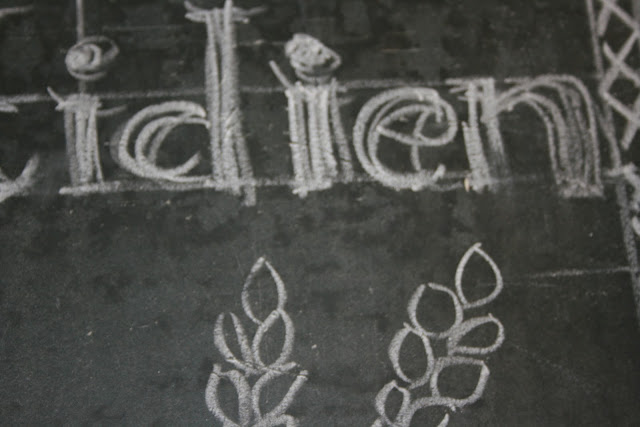
Here we are
beginning to add the largest elements
and some of the type
I really just loosely sketched
the words and art into the areas that were consistent
with my computer created graphics
the banner at the bottom says
"open daily"
One of the biggest issues I had was dull chalk ...it wouldn't fit into my pencil sharpener
so I used a paring knife,
but it was not the best solution either
Looking at the board at this point
I realized that:
1. my bread looked like a Thanksgiving turkey
and
2. there was no way I could fit all of those food items
on to this chalkboard ....
way to much wording
So I narrowed it down to just three words,
moved the wheat sheaths to the sides of a new bread sketch
and kept right on going....
reworking as needed
Adding a crosshatch border
was a nice element too
It took a few times
to get the style of the font
translated using chalk
I have to say, one of the best things about this type of project
is the ease in which you can wipe off your mistakes
and try again...awesome!
so here we are...
not finished yet,
but getting close.... even though my bread now looks like a baked potato
but the basic design is in place
and I learned a lot about the actual process of chalkboard artwork
I will share the finished board on my next post...
Did I mention how much fun this is!!!!?


It's looking good Kelley!!! And writing on a chalkboard is fun, takes you back to when you were a kid!
ReplyDeleteKat
You are so clever and talented....its looking great...cant wait to see it when your done!
ReplyDeleteHi Julie, Danni And Kat! Thank you for stopping by. Considering this type of project has been around non stop for the last year it is safe to say no tone will really critique my finished project too much... thank goodness for that right?!
ReplyDeletexo kelley
It looks wonderful Kelley, mais qu'est-ce que veux dire 'lucques'?
ReplyDeletePotato...bread...Your sign still looks great!
ReplyDeleteThat turned out so nice...I have an antique chalkboard from a church we used to attend hanging up...I think I may need to add some chalk art to mine.
ReplyDeleteDebbie
Kelley I love it, you designed it perfectly in the end. Sometimes it is difficult to get the chalk to really stand out; and I understand the chalk markers do not erase well.
ReplyDeletexoxo
Karena
2013 Artists Series
Oh my goodness...you are truly amazing...I wish I had the patience to pull something like this off...shared with my facebook followers...
ReplyDelete